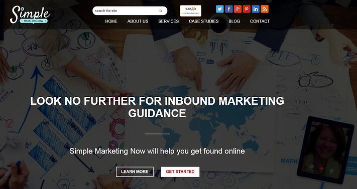
I've just completed an inbound website redesign with my own website and thought I'd share with you some highlights. Unlike many client projects I've worked on, this is more of an inbound evolution than a radical inbound makeover. However, it reflects many of the deliberate inbound decisions that I regularly discuss with clients.
Why Bother With an Inbound Marketing Website Redesign?
The biggest reason is to transform your website from a static digital brochure to a 'living,' digital entity which operates 24/7 in active support of your business. How? By attracting traffic to your site, providing means of converting that traffic into contacts whom you can nurture into eventually becoming customers. Your inbound website should also provide you with intelligence on how effectively the different parts of your site work on your behalf to accomplish your SMART goals so you know how to improve it.
Creating an inbound website means that you are thinking intensely about your visitors' user experience. You want them to be able to find the information they need easily; they should intuitively know where to go next because you've thought through the path that makes the most sense for becoming educated about the solutions you offer.
(Not too dissimilar from the path you might take exploring an IKEA store, for example. See How IKEA Creates an Apple-Like Retail Experience.)
As you do, you think deliberately about your customer personas, their steps through their purchase journey (and how that overlaps with your buying process), the problems they are looking to find solutions for and the words they use throughout it all. Those deep thoughts help you craft the flow through your website, the words you choose to describe the solutions you provide and the truly informative content you share on your blog and in the content offers you develop.
Inbound marketing changes how you think about customers. It makes you more disciplined about getting found online and connecting with prospective customers. Your website needs to reflect this.
What's Special About My Inbound Website Redesign?
My website is built on HubSpot's Content Optimization System (aka the COS), an integrated website, blog and landing page system which is optimized for the modern rules of SEO as well as for viewing on all screens, including mobile devices. The HubSpot COS also makes possible a personalized user experience which adapts to the unique context that individual visitors bring as they explore content online, and which epitomizes the selling potential of the website as no other tools can do. Think context marketing. More on that below.
Although my website was converted to the COS in September 2014, this newly redesigned site brings to life what's possible with an inbound website where you can focus on creating marketing that visitors love! More specifically, 
- It is responsive which means that regardless the screen you use (desktop, tablet, mobile), you'll be able to read what's on the page. It will resize to match your viewing experience.
- The flow of information is more logical, making for a more intuitive visitor experience. I moved away from the multi-column home page layout in October 2013, finding it too busy and distracting. The single-column scrollable format creates a more focused, yet relaxed flow where calls-to-action appear as they make sense based on the content.
- More white space to relax visitors and encourage them to browse and explore.
- Helpful navigation with search in the header and footer, a scrolling menu bar and a site-map like footer such as what Zappos began doing a while ago.
- Easy opportunity for discovery with fresh content from three separate blogs appearing on the home page. Furthermore, the blog section of the site integrates all three, while retaining each's separate identity.
- Much stronger visuals, including a very personal touch that captures how we work virtually (see image above :).
From a practical perspective, this redesigned website is intensely SEO friendly and fast-to-load. The HubSpot COS blog tool features a robust tool which brings to mind the WordPress Yoast Plugin with the added benefit that it integrates seamlessly with the HubSpot keyword tool. Content overall is easy to update and improve as you learn more about your customer personas and their purchase journey, and become more focused.
Deep Thoughts for an Inbound Marketing Website...
(Do you remember Saturday Night Live's 'Deep Thoughts by Jack Handey'?)
My favorite website redesign and ongoing content deep thoughts are inspired by Barry Feldman from Feldman Creative in this article titled Essential Copywriting Tips for the 3 Most Important Pages on Your Website. In it, he compares the role of the home page of a business website to that of a building lobby.
His home page pointers include:
Read the entire article. Bookmark it, print it out, refer to it regularly. It will keep you focused and thinking about how to ensure your website truly acts as your 24/7 inbound marketing and sales associate in support of your business.
What's Next on My Inbound Horizon?
The days of launching a website and walking away are gone. What makes a website a 'living,' digital entity which operates 24/7 in active support of your business is that you're constantly updating, enhancing, and adding content so the site remains fresh and relevant to your customer personas.
Now that SimpleMarketingNow.com has been redesigned I plan on experimenting with context marketing and how to be more relevant to my customer personas using smart content. Stay tuned for more on that topic!
Meanwhile, I'm excited about my new inbound marketing website. Special thanks to Inbound Design Studio for transforming my inbound dream into reality and to MKG Dept for redesigning my logo!


